« Chronique:BWU 27/01/2006 » : différence entre les versions
Page créée avec « ==Original== <toggledisplay> Posted by Frankie at 1/27/2006 3:32 PM PST <center>''' Bungie Weekly Update, January 27th: User In Yer Face '''</center> '' A unique Weekly... » |
m Lunaramethyst a déplacé la page BWU 27/01/2006 vers Chronique:BWU 27/01/2006 : Remplacement de texte — « BWU » par « Chronique:BWU » |
(Aucune différence)
| |
Version du 8 juin 2017 à 13:00
Original
<toggledisplay> Posted by Frankie at 1/27/2006 3:32 PM PST
A unique Weekly Update this week, where we talk to David Candland, our User Interface guru, about the work he's doing on <gasp!> our next project. Lots of insight and info on how our next UI might look and feel!
David Candland, our UI designer, now works in concert with Colm Nelson. Dave handles the visual look and feel of our new UI, while Colm handles how the UI actually works. Of course the two things actually work in perfect harmony when it's done correctly.
Dave is doing some of his prototyping using Macromedia Director – which is basically a quick and easy tool to get user interface "screens" up and running. Dave isn't wasting any effort here. Although his final art and design will be attached to custom code being written elsewhere at Bungie, the assets, art and animation used in the prototyping phase (or at least the ones Dave likes) will all be used in the final version of the next game.
At the moment the process works something like this: Colm submits a UI "tree" to Dave, a plan of the suggested navigation. Then Dave interprets that and creates the visual elements and transitions using the aforementioned Director, as well as other tools, like Adobe Photoshop.
The ability to rapidly prototype gives Dave the flexibility he needs to test, hone and tweak the UI right up until the last second. It may sound a little detail obsessed, but we're very concerned with making the entire experience of our games a pleasant and intuitive one.
Think about it: How many times have you struggled to find an option in an interface? We were actually guilty of this ourselves, in a more primitive past (and of course, we'll make mistakes in the future) so I'll use a Bungie example rather than picking on somebody else's UI. Go play Halo: Combat Evolved on Xbox at a LAN. Now, pop into the interface mid-game and invert your controller. Oh you can't? Let's all reset our Xboxes, stop the LAN and wait for you, you upside-down control freak.
Small things sometimes have large, unintended consequences in user interfaces and stuff that seems trivial at first, can become very annoying over years of use. And we want you to play our next game for years. For instance, there's a "sweet spot" for the ideal amount of time it takes to move from one settings screen to another. Dave thinks it's less than a half second.
He explains that saying, "That less-than-half a second isn't actually anything to do with performance – it's to do with how it feels to the user. Too rapid a pause between interface screens, say, control settings and game saves, and the user won't feel like they actually ‘went' anywhere."
So sometimes, you artificially introduce a pause – and marry that to a visual blend – say a slight fade out and then in again. Personally I'm a big fan of the caustically colored "star wipe" found in 1990s video cameras. That's why they don't let me over in that area. Ever.
Color, animation and sound all play a part in that feeling too. Picking hues that embody the spirit of the game, yet identify different sections of the interface is an ongoing aesthetic challenge.
A lot of institutions of interface are legacy. Folks expect UI to behave a certain way – a small stack of text that leads to subsequent stacks of text. Sometimes legacy exists for a reason – it's the best way to do things. But sometimes there are constraints – think about say, changing the options on a digital watch – you have like, two tiny metal studs. What combinations of button presses make the most sense to change complex features? Others are just bad, like VCR programming. That interface (and variants of it) was created in hell by the demon in charge of stupidity. But folks got used to it, and until TiVo, it wasn't really challenged. And there isn't a microwave oven in creation that isn't somehow, frustratingly different from your own at home.
Video game UI is the way it is because of the way it started. A joystick or paddle and a single button. In fact, the very earliest UI on consoles actually took place on the hardware. Remember those springy switches on the Atari 2600? That was a big deal in a world where 1k was a big chunk of the memory on a cartridge. UI would often eat up half your development memory.
A console generally has a joystick and at least one button. And that's usually the baseline for how the UI works. More buttons means faster options – "B" has become the default for reversing direction in Xbox UI – going back one stage, or undoing something. There are even (some) conventions for inputting text on virtual keyboards – "X" seems to be the default delete button now.
And that's something else we'll be paying careful attention to – how to input text quickly and easily. The Xbox 360 Live interface has its own conventions, so we'll bear those in mind when implementing text within our next game. It's possible for example, to input text into the Live virtual keyboard using a USB keyboard – although personally I seldom bother – it's a pain for me to grab a keyboard and bring it into my game-hole.
To demonstrate our new UI, Dave let me pull up the latest executable version of the interface. I tooled around with it for a few minutes and was pleasantly surprised. It certainly "felt" pleasant. It looks very different from anything we've done in the past. Part of that has to do with the 16:9 aspect ratio Dave demoed at. And that's yet another issue – how will an interface scale from 16:9 (Widescreen) to 4:3 (regular TV) ratios? How will text look at low resolution versus high definition? What if we implement split screen in our next project? How would each quadrant of a four player split-screen game look? All of these questions are ones being asked and answered, not only at Bungie, but anywhere next-gen software is developed.
In Halo 2, we learned a lot of lessons, both technical and aesthetic, about widescreen implementation. Our HUD for example, was a compromise in widescreen for performance reasons. Issues like that can be predicted better now, and that should lead to fewer problems of that ilk, in our next game.
In a way, it's two completely different versions of the interface, in both resolution and shape – but they have to look and feel identical to the untrained eye. You should be able to go play our next game at your rich cousin's house, and feel totally familiar with the interface on his 50 inch plasma, then go back to your crappy 14 inch TV and still get the same look and feel. The upside is that on the 50 inch TV, it should feel more awesome.
There is one perfect example of this working already – the 360 interface. The use of "blades" (like tabs in a filing cabinet) actually tricks the eye into thinking the aspect ratio falls somewhere between 16:9 and 4:3, no matter which aspect ratio you're looking at. The 360 interface also uses a left/right scheme "for big ticket" selections (Xbox Live, System, Games etc) and an up/down scheme for the more detailed sections within.
Colm's role is less visible to the user than Dave's. When you see a clean, well lit place to change options in the next game, you can thank Dave. But when you find it breathtakingly simple to select a different controller config, or adjust some hitherto unrevealed option, you can thank Colm. Of course, the process is more collaborative than the split I've been inferring. Dave and Colm's roles are distinct, but they intersect often, and always to the benefit of the UI.
Dave and Colm are both using elements from the game to frame and inspire their thinking. The UI needs to blend in with the themes and atmosphere created in the gameplay. Sometimes those will be literal – a backdrop for UI could literally be from a part of the game (think of the New Mombasa cityscape that gets a background flyby in the title screen of Halo 2) and sometimes they'll be thematic – a color, a shape, and of course a typeface.
A typeface can tell you at a glance, what the game is all about. And typefaces cause endless arguing and headaches. Halo, for example, would have looked completely crazy if we'd used a cowboy-style typeface, or even some classy olde worlde serif (that basically means a typeface with little "tails" on the end points of the letters - Star Wars logo is sans-serif and The Da Vinci Code logo has a serif) like Times Roman.
For the Halo games, we used futuristic looking typefaces because those were obvious choices that fit comfortably in the new game. We won't tell you what typeface we're using in the next project, but it is a very elegant solution (that might of course change) and ties in well with some interesting stuff Dave has been doing with illustration and renders. And best of all, I can play with all of this at any time. It's an executable PC file that's spewed out by Director.
I already did the best test of all – how long does it take, and how many button presses to change my controller settings. Answer? Not long and very few. And yep, there are some words in that interface, options, if you will, that would make your hair stand on end.
Mat Noguchi Update:
Mat says he's a crap magnet. He's at a stage of tools development, where everyone is using his existing tools, demanding that he fix ‘em and asking for new ones. As usual he waved his fist in the air and invented new swears, like, "Ass-weevil." I say he's more like a crap Katamari. He does roll around in it so.
Pete Parsons Last Day Today:
Goodbye Mango. We will all miss you. To quote the unknown Scottish poet, "Wha's Like Us? Damn Few, And They're A' Died."
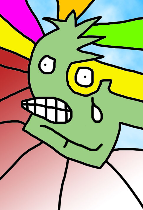
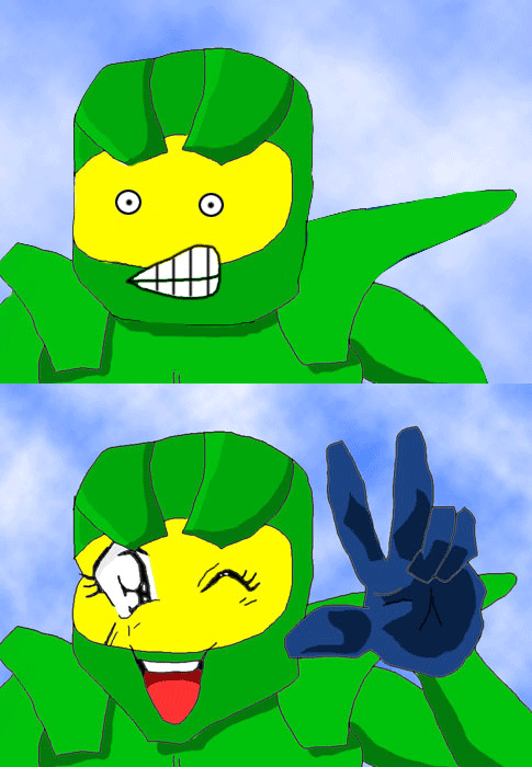
And finally, two bonus Mister Chiefs. Mister Chief's self image, and last, but not least, the first Animated Mister Chief.


</toggledisplay>