Chronique:BWU 22/10/2010
Original
Posted by urk at 10/22/2010 4:07 PM PDT
The run up to launch provided us with a wealth of rich and exciting news to cover, but as time marches on between this, that, and the next thing, it's simply inevitable that we'll have to slow this train from time to time and chug into some weeks where we don't have tons of hot news to unload on you.
This is one of those weeks. We're not exactly dark, but we're definitely more dimly lit than you've become accustomed to. I'm sure you understand. Here's an image filled with explosions to hold you over in case you came looking for tons of revelations:
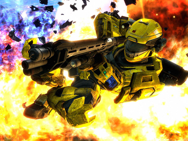
Of course, that doesn't mean that there isn't plenty of coal being shoveled into the studio engine this week. The Noble Map Pack has been powering through the requisite polish and bug fixing phases and the team is ultra close to sealing the deal and shipping the new maps out the door. Right now, we're prepping a trailer and small batch of multimedia aimed at getting you acclimated to the new spaces before you're forced to fight for purchase. The trailer is scheduled to arrive early next week. (Like really early next week if all goes to plan.)
Outside of the sweet visuals the Noble Map Pack puts on display, the trailer also contains a unique piece of music that seamlessly blends tracks from Halo: CE, Halo 2, Halo 3, and Halo: Reach into one beautifully orchestrated score. Marty, Jay, and C Paul have been hinting that they'd like to make it available as a standalone download soon after the trailer drops. Keep your fingers crossed for a Friday deployment next week.
No promises.
Take a Synthy Tour of Tempest!
[Média indisponible]
Okay, so maybe I was totally wrong about this week's update. Bam! Hopefully, this Photosynth of Tempest ties you over until next week. Now, let's get some housekeeping out of the way.
Arena Alterations
On the playlist front, we're currently testing out some totally radar-less Arena action. Aside from the obvious impact this will have on the playlist as a whole, it will also sound the death knell for the Active Camo Armor Ability in this particular playlist format, as there's literally no downside to getting your cloak on when radar isn't in play.

If all goes to plan, expect to see this change hit the Arena at the beginning of next month, just in time for Season Numero 3. We'll supply you with some more fleshed out bullet points as the November playlist update becomes more and more solidified in the days ahead. As with all early news, details are always subject to change.
Forging Ahead
This week we're also neck deep in Forge Map Variant submissions for our official Forgetacular contest. Though DLC testing has slowed the pace of our official evaluation process, it moves ever onward, and even outside of the auspices of Forgetacular's winning entries, we're still looking to deploy more community variants into matchmaking.
More Like Forgecrapular!
To aid you in your quest, Carney tells me he's nearly finished hammering out the curriculum for the first semester of his official Design 101 correspondence course. Personally, I've been hammering through some of the hundreds of Forgetacular submissions we've already been blessed with, and I have some words of wisdom I'd love to hammer home myself. While we wait for Carney to deliver the real goods, check out my crash course!
Forge Design .01
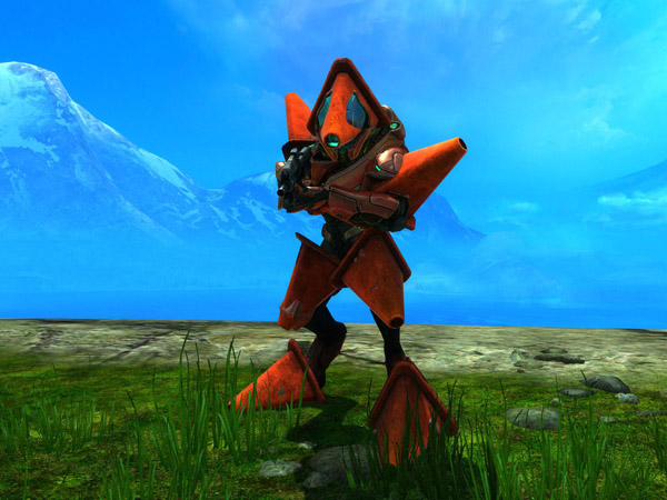
Mo Money, Mo Problems
First things first, you are not required to utilize the entire budget when you set out to build your sweet new map. This is not how you win Forge. In fact, if you've whittled down all the credits in your Forge wallet to make an amazing Race map, and you don't have enough bucks left to splurge on a single solitary Mongoose, you just might have yourself a little bit of a problem. If I can't race on your race map, you lose! You should resolve this minor error before you submit your map, speed racer.
Objectify My Love
On a related note, you should also be paying close attention to "object density" as you build your masterpiece. Though the Forge will allow you to phase several objects into one another, it is not recommended that you stack as many objects as possible into a small amount of real estate simply for aesthetic effect. You can and will go overboard.
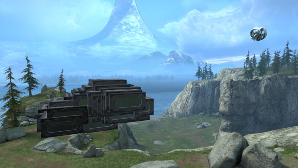
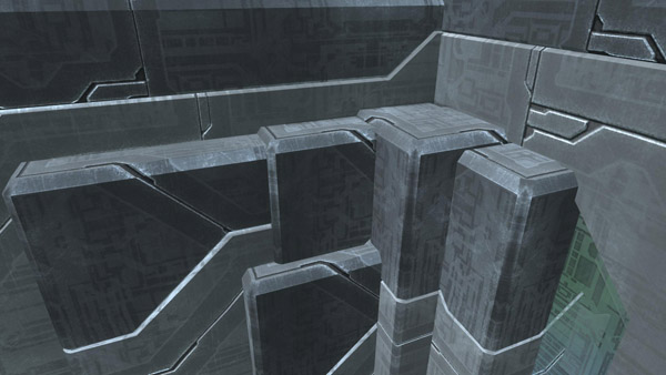
In these shots, there are 100 blocks piled into one single floating heap. Players tend to phase a lot of objects together in order to create fine details not possible with the available set of Forge pieces. I've seen a player merge more than a dozen objects into a single light to create a rather ornate and spectacular chandelier. While it may look visually impressive, functionally it operates more like a Forge black hole, requiring players to render an absurd amount of objects for what amounts to a small piece of visual flair. When I removed all of the superfluous pieces from the beautiful fixture in question, the base map was left largely unchanged and the overall performance increased dramatically.
Eye of the Beholder
Of course, that doesn't mean you should pay no mind to how your map looks, especially when thinking about how players will orient themselves. It's a good idea to use existing visual cues to allow players to ground themselves quickly on your map. Atom is a great example. Each side features distinct "Team" colors, both red and blue, to help your eye pick up on your spawning location instantly. It also uses colors in other key spaces to highlight areas of interest to great and inexpensive effect. The map itself is nestled in the Quarry, giving Atom a rock face on three sides and a distinct open view on the fourth.
None of these design cues required any additional objects. And it's a certified fact that each and every one of you loves Atom.
And the Sky is Grey
One sure fire way to keep your players dazed and confused is to stuff them inside a giant grey box that offers little in the way of visual distinction.

While the Forge palette relies heavily on the metallic Forerunner aesthetic, Forge World itself offers plenty of scenery that stands in stark contrast. Utilize it free of charge.
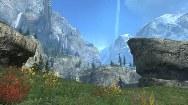
Of course, if you're making stuff like this…
…or this…

…or this…
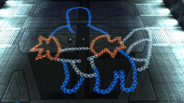
…performance is not a concern and you should feel free to place objects wherever you damn well please.
Nobody Puts Baby in a Box!
But maybe you should. The Coliseum might seem small, but trust me, it's really big! And the walls each feature distinct elements that make them stand out from one another.
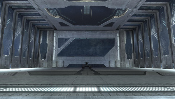
It also gives you six planes to work from right from the start. While it might not make for a great Big Team Battle space unless you extend the playable space out over the water, it's easily big enough to contain some expertly crafted Slayer and Objective spaces, especially if you build in layers.
Spartometer Challenge Tracker
And we're off! As of right now, the front page has been updated to display your current community Challenge progress. Keep on keepin' on and the carnage will automatically update until we blow the top off, unlocking access to new ranks and armor.

Oh, and nope, we're not at zero. The circular reservoir at the bottom of the thermometer represents the millions of challenges you've already completed.
Pimp My Spartan…Now!
Of course, we're aware that the Bungie.net version of your Spartan armor isn't currently updating. We don't have an ETA for a resolution, but rest assured that we'll deploy the fix as soon as we can. The backend systems that power your Spartan's online presentation are linked to other critical systems related to our online and matchmaking experiences, and we are, as you would expect, incredibly thorough with any testing and deployments that could impact those systems.
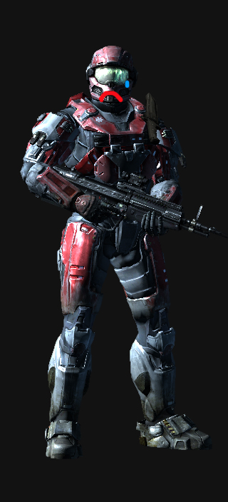
We'll update you when we're ready for you to ogle your online persona again. Until then, you'll have to make do with your in game model. Please pardon our dust.
Blame Stosh
Stosh spent a good amount of time this week building the aforementioned Spartometer to track your challenges, but he also dedicated some spare cycles to dig up this sweet clip.
When good Rod goes wrong.
And that's a wrap for this week. Stop back next week. We'll make it worth your while.